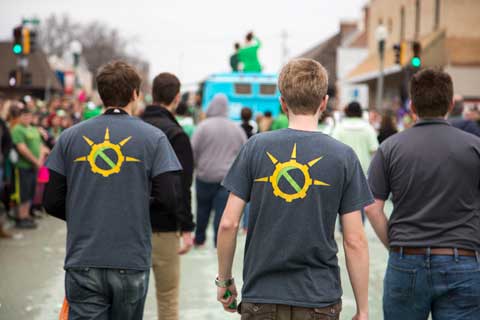
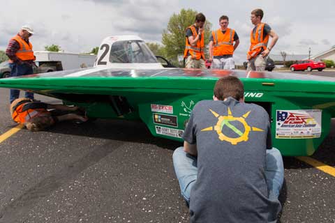
 During Spring 2014 I worked extensively with the Missouri S&T Solar Car Team to rebuild the team brand from the ground up.
When I stepped into this project, I inherited a brand that had nearly zero continuity. Print and web pieces were haphazardly thrown together sharing only a logo, but no common visual styling.
The team and I began with a new logo, shown at right. This logo is based heavily in both university and team history. The school mascot is the Miners, whose colors are green and gold. The pick-axe ties this well-known symbol of our campus into the team brand and uniting the team with campus. The sun is at the core of all that the team does, and visually joining it with a gear symbolizes all of the design and fabrication that goes into the solar car.


Following the logo, we began to implement an entire team brand around this "sunburst" logo. Utilizing a grey base, the green and yellow in the logo, and a university-used orange I developed a consistent print media brand that we rolled out into the summer of 2014 along with a new message: "Recharge". With the Recharge came a renewed focus on photography within the team. This all culminated into a fundraising packet sent out to team supporters, who gave us a lot of wonderful feedback on our new visuals.


Today, the brand continues to evolve. The team has undergone an entire revitalization under the Recharge brand, going from a team that consistently finished near the bottom to a valiant return to top-tier solar racing. Using the brand I designed, they have grown to fit into it and continue to push it further as they shift from recharging to performing. Check out some more samples of the team brand below!